
I’m cleaning out my SD cards for the trip and realized I have things on there I never got a chance to post. So now is as good a time as any to post them. Here is a series of photos I took of my watercolor process. The example I used was the 3rd to last page of the book. I would upload an image of the final artwork but my computer just exploded (literally…smoke came out and everything) so I dont have access to those files right now.
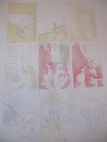
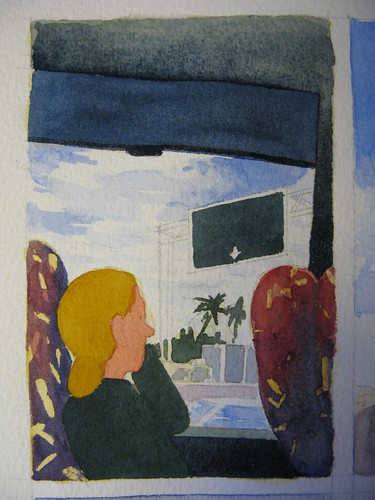
But here’s a photo of the panel I focused on when it was just about but not quite yet done:

OK so I penciled the book all the way through on bristol board with Col-erase blue pencils. Not the photo-safe blue (too waxy), just blue. I like the way it sticks to the board and it sharpens nicely.

Now, this is probably not the most efficient way to do this. I’m there are better methods for watercoloring a comic. This is just how I figured out a way that would work for me. I like having the pencils on a separate page so that I can swirl around the figures a lot and erase and redraw and make a mess and then when I finally have it the way I want it, I trace it onto a piece of watercolor paper with a lightbox. In order to be able to trace it, the watercolor paper has to be fairly thin, so I use Arches 90 lb cold press.

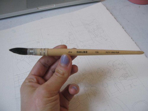
Its true that you dont need expensive brushes. My favorite brush was some green handled synthetic thing that came from a set of cheap Da Vinci brushes. BUT my studiomate Domitille Collardey raved about this Petit Gris Pure brush and let me borrow it for the last couple months I worked on the book. Its squirrel hair or something. Its great! But I still love my crappy Da Vinci brush too.
I heard that a lot of people put down a wash of yellow underneath all their watercolors (except reserved whites) and that because of the way light passes through the layers of paint, it creates a more luminous effect. I didnt listen to this for a long time and then about halfway through the book I tried it and it really does make things look great. Besides whatever optical effects the yellow has on the paint, it also unifies the page to have one underlying color I think. On this page, theres a nightclub scene with pink and green lights, so I did the same thing only swapped out those colors for yellow on the underlayer.
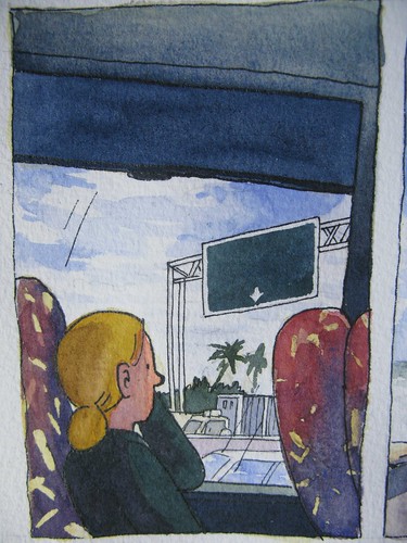
Please forgive these horrible photos…I couldnt really adjust the contrast on them because of the exploded computer. I’m using a free image editor on a netbook and its not ideal.
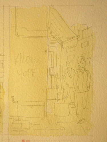
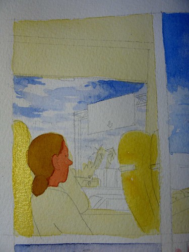
Heres an outdoors panel, all yellow except for the reserved sky. I use naples yellow for the underpainting.
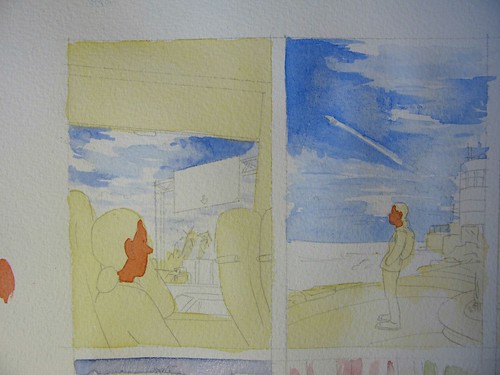
I usually put down skintones first, then the sky. For skintones (at least for my character’s skintone) I use naples yellow with cadmium red. For sky I use cobalt blue. I only use cobalt blue for the sky, it doesnt really mix nicely with other colors. Usually french ultramarine is the only blue I use, but I dont like it so much for most skies. By the way, I use winsor and newton tube watercolors.
I put down some masking fluid for the patterns on the bus seat upholstery and then started just putting down layers. I didn’t really have a plan for these seats, but decided more yellow would be a good way to go.
Then I put some more color down…
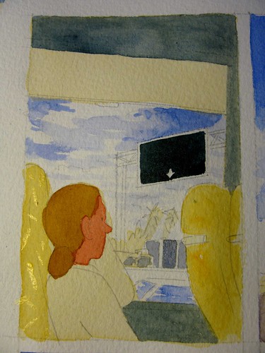
Did something to the seats…
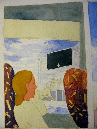
You get the idea…
Once I have everything about where I want it, I put in extra shadows at the end. If you’re dealing with sunlight or tungsten light I use purple for shadows (ultramarine and cadmium red). I put it wherever it makes sense for a shadow to be. Any wall which has a window with sun shining through it, the side and back of a person, hair, etc. Again, this is just how I like to do it. Its not the only way of course.

I ink at the end on top of everything with a rapidograph when I think I’d done but I usually go back in later and put down more paint when everything dries and inevitably looks more pale than I would like. But that’s about it!
UPDATE: Here is an awesome watercolor step-by-step from the talented Mr. Scott Campbell:
http://scott-c.blogspot.com/2011/02/twin-peaks-making-of.html


Did you have any trouble with the paper buckling/warping?
(great post, btw – very helpful!)
Thanks for sharing this. I'll have to try that underpainting technique.
Love this. It's really exciting to see your process!
Sarah, thanks for the watercolour "how to"!
Very cool!
And I like your stuff!
ArrrOOooo!
Thanks everyone! And Dylan, it does buckle a bit but to fix that I lay the finished page (pre-inking) face down on a clean sheet of paper, then take a very damp towel and moisten the back of the paper. This will flatten it out and then I put another piece of paper on top of that and lay books on it overnight. Or if you have an oversized scanner, it can flatten out the wrinkles.
Thanks everyone! And Dylan, it does buckle a bit but to fix that I lay the finished page (pre-inking) face down on a clean sheet of paper, then take a very damp towel and moisten the back of the paper. This will flatten it out and then I put another piece of paper on top of that and lay books on it overnight. Or if you have an oversized scanner, it can flatten out the wrinkles.
hey, sarah, your book got a review here http://g4tv.com/thefeed/blog/post/708867/Superman-Earth-One-Reviewed-On-Fresh-Ink-Online.html
thought you may like it.
Sarah, do you ever consider finishing your comics without ink, just leaving the colors? The spots of color beside each other have a really beautiful look.
Thanks John…I have considered that, or maybe using a dark pencil instead of ink or none at all. Its something I'm thinking about for the next book.
Yeah, or doing subtle linework in color (color that relates well to the color of that particular form) using a very fine brush could be really nice.